Speculator “The Calm and the storm” Magazine Cover Spread | 2016 Creative Director, Graphic Designer
Concept:
This cover spread for the December 2016 issue of our digital magazine explores the theme ‘The Calm and the Storm.’ As the creative director, I aimed to capture a sense of visual contrast that would resonate with readers from the outset. Drawing on vintage art and advertising as key influences, we sought to convey calmness through muted colors and nostalgic textures, while incorporating the storm’s chaotic energy through bold, spontaneous collaging techniques.
Process:
To achieve this visual balance, I mixed soft, vintage-inspired hues and textures with elements of collage to create an intentional sense of contrast. Layering vintage aesthetics—subdued colors, classic fonts, and aged textures—with the unexpected, fragmented nature of collage brought an engaging tension to the design. This approach not only honored the thematic duality but also gave the cover a tasteful, refined look that embodied both the calm and storm visually. The final result serves as an inviting yet intriguing introduction to the issue’s content.
One of the key challenges for this project was transitioning to a digital format, as previous issues had all been in standard print. With this new platform, we had to rethink layout and formatting entirely, adjusting our design choices for digital readability and fluidity. As the creative director, it was my responsibility to ensure this format shift was understood across all sections of the magazine—working closely with editors, designers, and sometimes even writers to guide this new approach. Alongside these structural changes, I focused on maintaining thematic cohesion, encouraging each contributor to embrace the 'Calm and Storm' theme in their designs to create a unified, visually compelling issue.

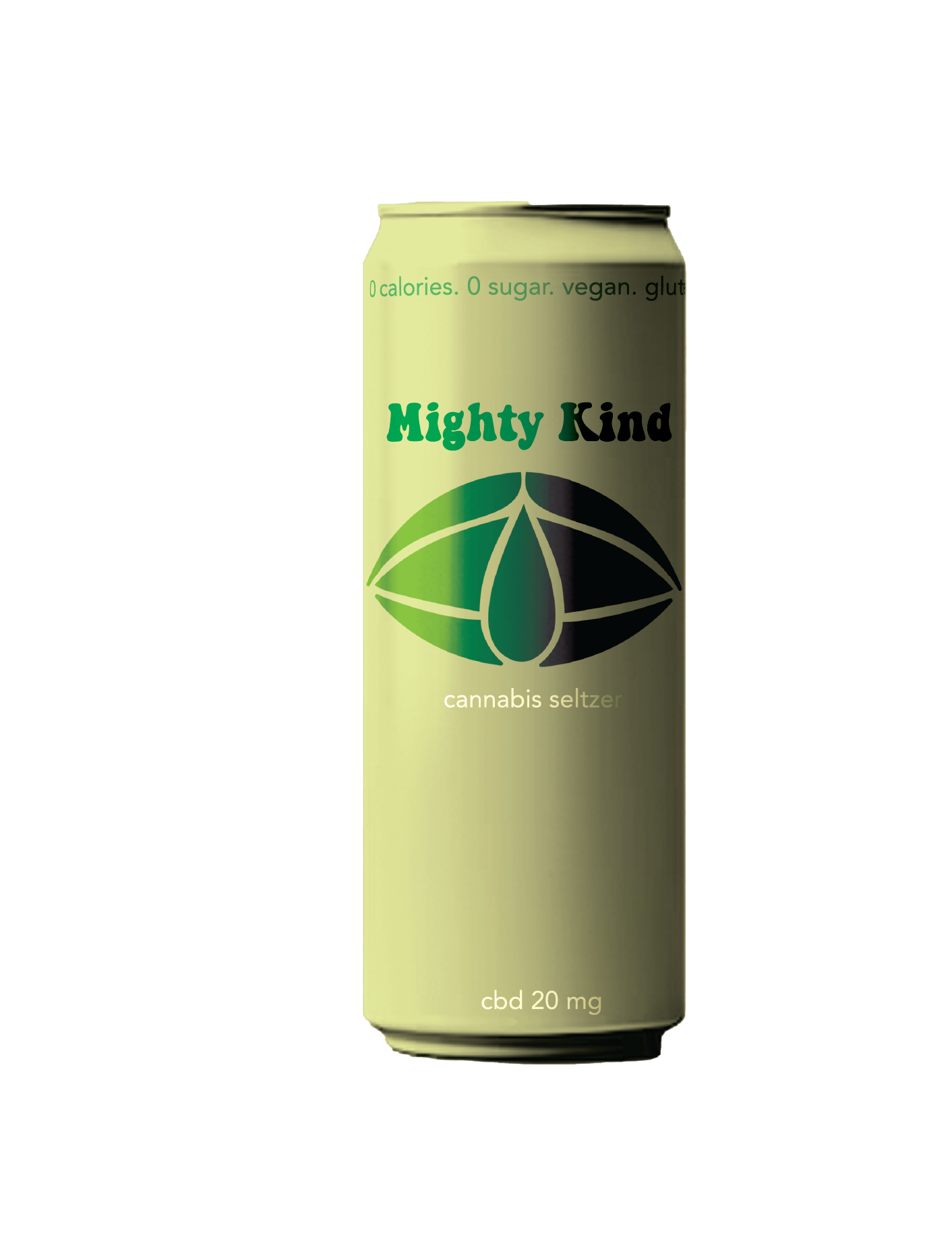

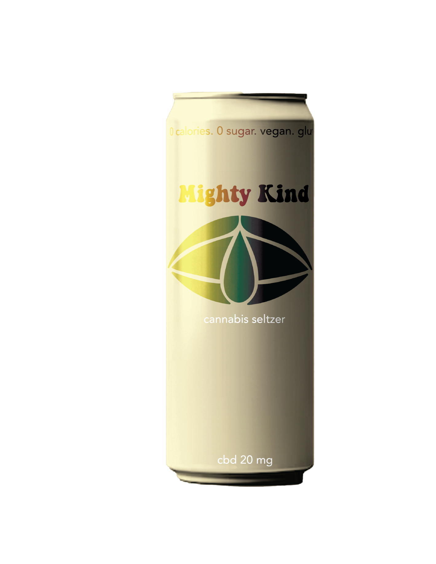
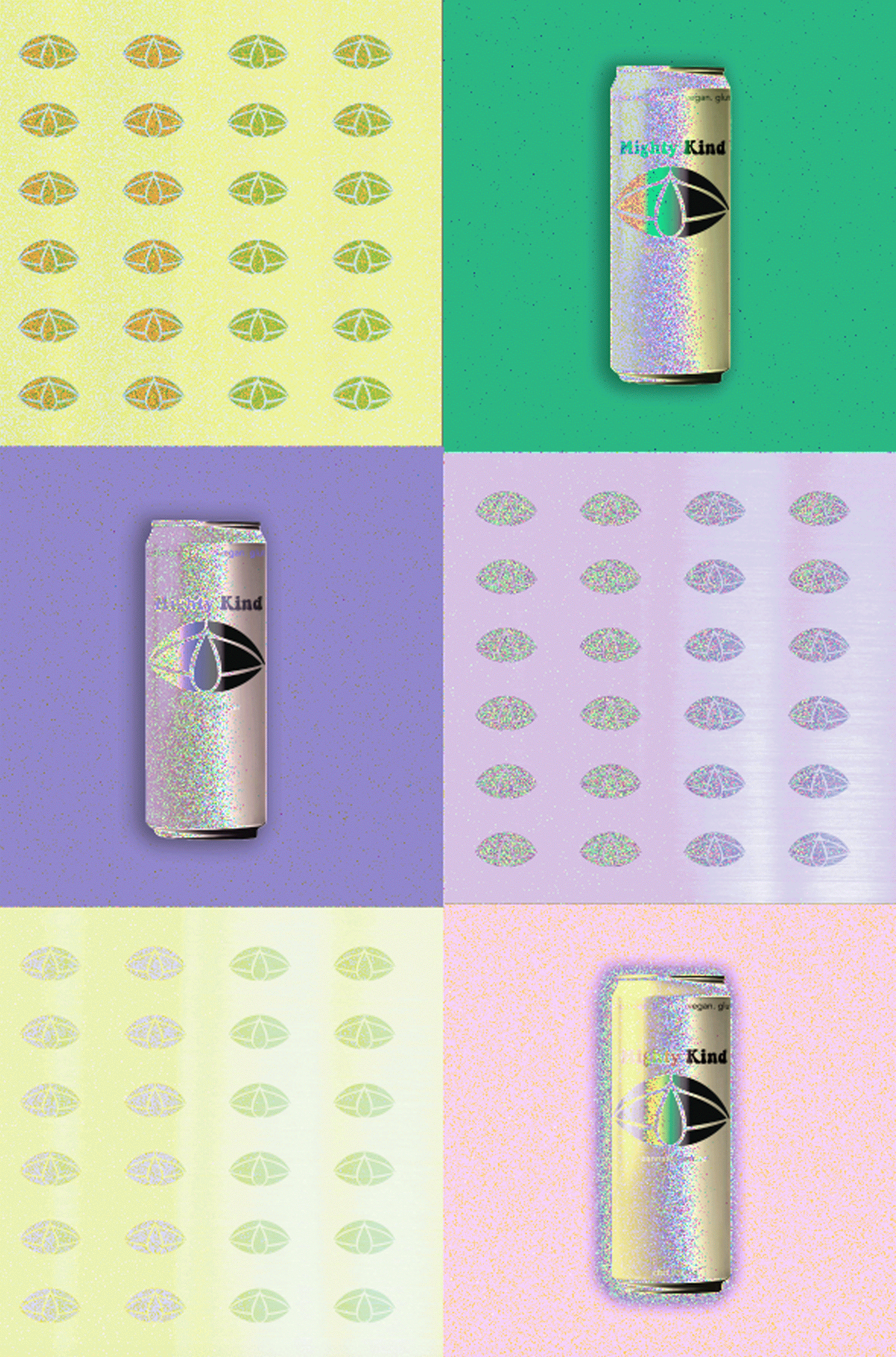

Mighty Kind CBD Seltzer Branding
This project focused on creating a fresh and approachable brand identity for Mighty Kind, a CBD seltzer company. I designed a clean, modern logo inspired by natural forms to reflect the product’s wellness benefits and crafted a cohesive packaging system with a vibrant yet soothing color palette. The repeated patterns and subtle gradients enhance the brand's playful yet sophisticated feel, making it stand out on shelves. This branding strikes a balance between relaxation and energy, perfectly aligning with the product's purpose
I led a full rebrand for Mighty Kind, redesigning everything from the logo to the color palette and typography. My work extended to packaging design, including the cans, to create a cohesive and recognizable brand identity. The goal was to convey the product’s wellness and modern appeal through clean, bold visuals and a refreshing color scheme. This project is ongoing, with more branding elements in development to further enhance the product’s presence.
It all starts with an idea